Monday, October 5, 2009
Event Poster!
We have been working on our next project, the event poster. To start things off, we took pictures of texture then upload them. We had to think of an event we wanted to advertise. I did Fearfest since halloween is near. I drew a scary girl screming her head off and scanned it. I put a scratched table texture as the background of the poster and put the drawing over the texture. Line drawings look good over textured beckgrounds. I made the background dark and inverted the drawing to make it stand out. I downloaded a text from deviantart.com that goes with the scary theme. That is where I am at now. I still need to work on the text and possibly adding blood splatter to the poster.
Alternative Representation
For the Alternative Representation project, the class was to come up with a design and take pictures of the design represented through different media. We could use any type of material like cut paper to hair from a drain. I chose to do the knight from chess. I used tape, chess pieces, hershey's kisses, fog, a leaf, hair, oatmeal, my dog, eggs, and spray paint. After we were done taking pictures we had to edit them on photoshop and we were also allowed to photo manipulate 2 of the pictures. Then we had to pick 2 and make an advertisement out of them. This project was fun, playing with photoshop and forming things into the shape of a knight.
Saturday, September 5, 2009
Logo of Ideas
Last week in class, after we finished the visual story, we started a new project dealing with the same concepts. But instead we had to first write down words any object or action we could think of that early in the morning. My list was pretty long thankfully I had breakfest that morning. Then came the part where we got to draw. We had to draw all the words we came up with and using simple shapes like circles, squares, and triangles. As we sketched, we were suppose to see the similarities in shape of the objects because in the end we were going to have to combined two or more objects for a logo but we were not to stick to one idea because an idea for a drawing could hit you at any moment during the first week. Then we had to do about ten or more drawings until we narrowed it down to a few drawings. I ended up with a campfire that looks like a spider and a man on a horse-drawn underware carriage. I have not decided which one I like the best but I am leaning more towards the spider fire.
Gestalt
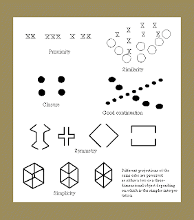
Gestalt- Theory that makes unity and varity possible.
Gestalt means "form" or "whole" in German.
Gestalt deals with visual perception and the relationship
between the parts and the whole composition.
The key principles of Gestalt are Emergence, Retification, multistabilty, and invariance.
Gestalt is broken down into laws of study:
Closure: the mind supplies the missing part of the composition
Continuance: the eye traces the direction it moves in
Similarity: objects that look the same as one another
Proximity: when objects are close together they tend to be grouped together
Symmetry: objects that are symmetical are perceived collectively.
Common Fate: objects with that same moving direction are perceived as a collective or unit.
*Image used from yahoo search*
http://www.etsimo.uniovi.es/hypvis/vision/gestalt.gif
Saturday, August 22, 2009
Semiotics
As we started the second day of class,
we came across the word semiotics...
Semiotics, Semiotics, Semiotics....hm
What does that mean?
Well it was actually quite simple really.
Semiotics means the study of meaning of things.
Otherwise, studying of signs.
Then we learned more words that will become useful
like denote and connote.
Denote means to signify directly.
Connote is to suggest or imply in addition to literal meaning.
Examples would be:
A red light denotes to stop.
Hesitation of a leader connotes weakness.
Then we got to Ferdinand de Saussure...
he came up with dyadic signs, meaning 2 parts,
Signifier+Signified
Signifier is the thing that is representing, the form
Signified is the concept that is represented, the meaning
After learning some key terms we got to see some materials
we will need for this semester like brushes, ink, and pens.
Finally we came to doodling...
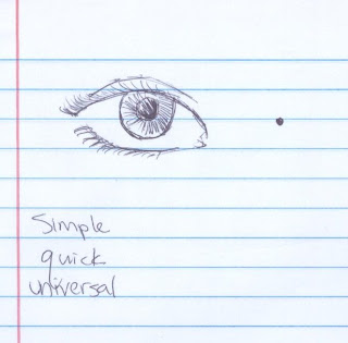
Professor Babcock asked the class to draw an eye...
I thought which one did he mean??
An eye or an "I"
so I went with the eye instead.
When we stopped he looked around and saw many
had drawn an eye that was detailed, me being one of them...
It was what we were taught to do in our earlier art classes,
But he showed us just making a dot is an eye too, he wanted simplicity.
Plus the dot is universal.
So then we tried an Exercise
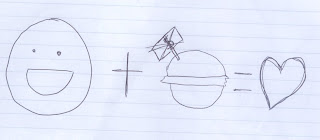
we were supposed to show a positive consumer experience
using the concept of simplicity.
It didn't matter if the doodle did not look good
as long as the concept was known.
Like in my above picture I guess someone would think
I'm happy and I got a free burger which I loved
but someone might think of something else of the picture.
I learned to use shapes not lines to convey
the meaning of the picture.
we came across the word semiotics...
Semiotics, Semiotics, Semiotics....hm
What does that mean?
Well it was actually quite simple really.
Semiotics means the study of meaning of things.
Otherwise, studying of signs.
Then we learned more words that will become useful
like denote and connote.
Denote means to signify directly.
Connote is to suggest or imply in addition to literal meaning.
Examples would be:
A red light denotes to stop.
Hesitation of a leader connotes weakness.
Then we got to Ferdinand de Saussure...
he came up with dyadic signs, meaning 2 parts,
Signifier+Signified
Signifier is the thing that is representing, the form
Signified is the concept that is represented, the meaning
After learning some key terms we got to see some materials
we will need for this semester like brushes, ink, and pens.
Finally we came to doodling...
Professor Babcock asked the class to draw an eye...
I thought which one did he mean??
An eye or an "I"
so I went with the eye instead.
When we stopped he looked around and saw many
had drawn an eye that was detailed, me being one of them...
It was what we were taught to do in our earlier art classes,
But he showed us just making a dot is an eye too, he wanted simplicity.
Plus the dot is universal.

So then we tried an Exercise
we were supposed to show a positive consumer experience
using the concept of simplicity.

It didn't matter if the doodle did not look good
as long as the concept was known.
Like in my above picture I guess someone would think
I'm happy and I got a free burger which I loved
but someone might think of something else of the picture.
I learned to use shapes not lines to convey
the meaning of the picture.
My college plans
I have gone through my Art survival guide a year ago
and I wrote down a schedual of every semester in a
little black sketch book I had kept around the house.
I recently just opened it again and found that my plans are
a little flawed like this semester I'm supposed to be taking two other
art classes Design III and Figure Construction other than Intro to Graphic Design and Illustration and Art History I.
However, Design III was closed when I was registering and I wanted to take
a literature class and get some general educations done so I could focus next semester on my major classes.
I plan to take Painting I, Typography, Intro to Printmaking, Art History II, and possibly Design III and Figure Construction if I can find a good time for it. I hope to get back on schedual during my Sophomore year.
Then by my junior year, I can take Illustraion Techniques, Drawing 3, Watercolor, Illustration Concepts, Painting 2, Sculpture, and Concept Art and Design spread in two semesters.
For possibly my last year, I think I'll be taking Adv. Illustration I, Logo and Trademark Design, Fibers, Adv. Illustration II, Studio Seminar, 20th century Art and Architecture, ICAP Artists in Contemporary Society, and maybe one more art class.
Wednesday, August 19, 2009
Subscribe to:
Comments (Atom)

